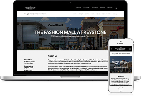
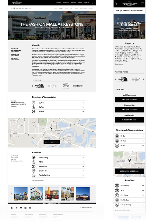
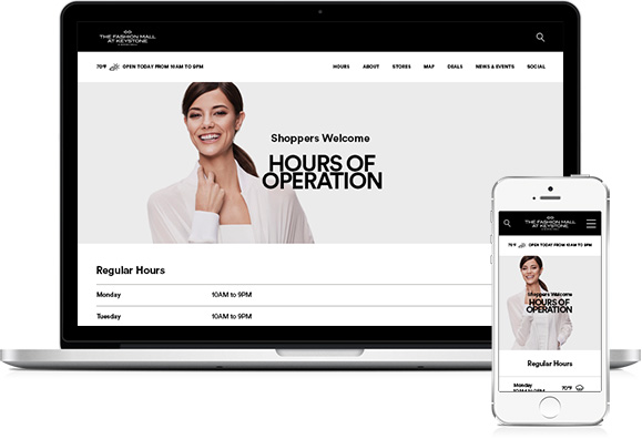
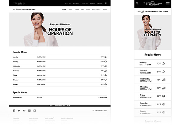
I’m an award-winning, Cincinnati based creative with over ten years of experience in design. I believe that brands find the most success when they understand and genuinely meet user’s needs. So, I’m happiest when I’m able to employ my aptitude for strategic thinking to craft holistic consumer experiences that do just that. I love to learn and find joy in creative collaboration. Fortunately, my work in a variety of design fields and cross-disciplinary environments has provided ample opportunities for both.
Most recently, I found success at Organic where I played a key role in conceptualizing and executing an award winning campaign resulting in unprecedented results for our animal healthcare client. When I wasn’t dreaming up large-scale campaigns or developing new brand identities, I was designing marketing communications where I worked to ensure even the smallest element was working it’s hardest.
The re-design of Simon Property Group’s network of websites propels Simon into the mobile-responsive world, broadening the site’s reach while improving user experience. A new set of icons as well as a re-design of all of the site’s forms and interface options create unity through every page. The new responsive design delivers the plethora of information for each mall in a clean, manageable package while visually supporting Simon’s fashion-forward brand on every device.
UX Lead: Travis Ritchie, Front End Developer: Alex SperellisLocal mall teams post news, deals, and events to their content feeds. The simple card layout accounts for user-submitted inconsistencies by displaying information optimally, regardless of image and description dimension or omission.
The item in the content feed can be expanded to reveal more information. Access to related content feed items allows for easy browsing.
Each about page provides a home for details and logistical information about the mall. It is imperative that when users visit this page, they are able to find what they need quickly and easily. Commonly sought out information and key links are featured in the left side of the page while icons help users scan and locate desired information. Collapsed accordion menus save space, reducing unnecessary scrolling while still providing access to detailed descriptions.
Regular mall hours are featured in an easy-to-read table. Special holidays, dates, and hours are listed below. The week’s weather forecast, featuring special designed weather icons, help shoppers plan their next trip.
Redesigned driving directions page allows users to navigate to the mall without visiting another site. A “use your location” option, auto-fill, and a familiar interface makes finding directions to the mall quick and easy.
As part of the redesign, all online forms were standardized and redesigned for ease of use. Useful information and key links are set at the left hand side for increase visibility. Simon’s Contact page is simple and useful.